

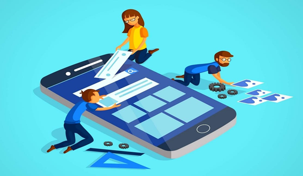
The Dos and Don'ts of App Development
On the off chance that you are anticipating planning your fantasy app and make it stand out of the app swarm, at that point you should peruse the...
5 min read


Using an app and designing an app are completely different things. If an app is designed well, you won't notice the design because you'll be too busy enjoying the app itself. But if an app's design is lacking, it's likely the first thing a user will notice.
Consumers world-wide love spending time on their mobile devices. Revenues from mobile apps are forecasted to reach $189 billion in 2020. But on the flip side, a whopping 60% of all apps have never been downloaded.
These figures demonstrate that innovative and intuitive mobile app design is more imperative than ever before to stand out from the crowd. So, how can you set your mobile app for success? Start with these digital design Do's and Don'ts.
Use this discovery phase to hash out the difficult details of your mobile app design.
Figure out who your users are: build a user persona with an understanding of their background, their problems, and what they're really looking for. This will help you design an experience that your target audience will love.
Narrow down your app's scope, budgets and timelines, core features, and future goals.
Look to your competitors to see what their designs look like. Find apps in other verticals with designs similar to the app you're designing. Critique and praise others' designs to figure out what works for your app and what you should discard.
You should also make sure you start with Apple and Android's mobile app design guidelines to create a bare-bones framework to build upon.
Don't get impatient. The discovery phase almost always takes longer than you'd like. But if you've ever designed before, you know that investing time in planning can make the rest of the design process go much smoother for everyone involved.
Don't forego user experience research. Find your ideal users and get to know them; these personas will seamlessly drive the rest of the design and app build.
Let your users play around on your app before gently asking them to log in or sign up. Users don't like being required to create an account before getting to use the app. To ask a user to share their data with you, you must make your app worthwhile to them.
First impressions are everything; 24% of app users never return to the app again after the first use. And with 57% of downloaded apps deleted sometime in the first 30 days, user retention directly impacts the app's revenue potential.
Create a short 3-5 step tutorial for users to quickly gain an idea of how the app can help them and what it accomplishes. Use this chance to show the value your app provides for users.
Further, consider creating an interactive tutorial (often called "contextual onboarding"); your app only pops up tutorial information when the user interacts with a feature for the first time. This approach makes your user's experience discoverable.
Don't give your users a reason to download your competitors' apps with unnecessary complexity. New users can easily become overwhelmed with choices and confused by the layout of an app they've never used before.
Onboard the user from the beginning and they'll be more likely to stick around.
Theming is one of the most obvious parts of the app's design. It's visual, conveys feelings without explicit words, and can even help the user become relaxed and comfortable during the experience.
To create a successful theme, keep every aspect of your design consistent between pages, devices, and even communications. Use high-quality images, strong typography, and a minimal style. Bonus points if you can create a memorable voice for your copy.
Keep in mind that apps have a very small amount of screen real estate, especially compared to tablet and desktop devices, so don't clutter up your app.
Don't design your app based on what's trending right now.
To avoid constantly changing your design and brand guidelines, create a more evergreen design that needs to be updated every 3-4 years instead of every time the design goes out of style.
Make sure you use a navigation style that's familiar for users. We recommend using the tab bar for iOS mobile apps and Navigation Drawer for Android apps.
Keep the navigation simple. Establish a clear hierarchy of screen flow by assigning different priority levels to the core user options/tasks. Refer back to these priorities to guide the navigation menu and app structure.
Use familiar screens, like Getting Started, Feed, Shortcuts, Search, My Profile/Account, and others.
And when a user stumbles upon an error, meaningful error messages can really improve your user experience. Make sure you give information to the user about what went wrong and what the user's next options are.
Don't give users too many choices. Keep your navigation simple and minimal, and make relationships between choices obvious so users know what to do next time.
Don't design an app that behaves un-intuitively. You must give your users a strong sense of control over your app.
Your app wouldn't accomplish anything without user interactions. Include micro-interactions for same-screen effects.
Transitions are animations that can really take your mobile app design up a few notches, but it's important to be subtle with them.
When you reach a crossroads, remember to prioritize clarity over visual appeal.
Don't overdo your transitions; make them fluid and enjoyable, not too fast and not too slow.
Get feedback from users about the intuitiveness of these animations and micro-interactions. Make sure you're not going overboard with your app's interactivity.
And don't forget that every action should have a counteraction that's immediately visible on the mobile app. This includes, for example, a Back button or a Cancel option.
As designers, we often forget that we work with normal vision to create beautiful experiences. But the reality is that, globally, 4.5% of people experience color-blindness. Another 0.6% are blind, while 4% suffer from low vision.
Thus, readability, conciseness, and high contrast are three big pillars of mobile app accessibility design. You'll need to work closely with developers to ensure your app integrates well with popular screen readers.
Additionally, make sure that your buttons are clickable by human fingers and thumbs. An MIT study found that a good minimum touch target size is 10mm x 10mm. It's absolutely vital that you leave enough space between buttons and navigation items so that users don't get frustrated with an unintuitive experience.
Don't put too much text onto a screen. Generally, try to use between 30 and 40 characters per line.
Don't slate accessibility as the last priority as a designer or for developers. You should take care to make your app's experience accessible for people with hearing, vision, and mobility issues.
Design your app to be offline-first. Cache the important assets and figure out what you can load later by trimming down your content to only the essentials.
Show an animation to the user while content loads. For wait times longer than 10 seconds, you should instead show a progress bar so the user can estimate the total load time. A skeleton loading animation is popular these days; it gives users the impression that the app is working to quickly load information into place.
Don't forget your international user base. As India and many other third-world countries get more access to the Internet in the next five years, slow connections and spotty network connectivity will be commonplace for these users.
Some key takeaways from this post are to place the user first (always), spend time and effort creating a rock-solid plan using learnings from the discovery phase, and continuously ask for feedback on the design and feel of the app.
Designing an intuitive experience is difficult, but more value and enjoyment for your users make it well worth it in the end.
Need help with your app? Get in touch
On the off chance that you are anticipating planning your fantasy app and make it stand out of the app swarm, at that point you should peruse the...

The development of technology and the accelerating growth of mobile phone usage has heightened the demand for app developers to extend beyond meeting...
Today the concern of mobile application usability is a major worry for many organizations. The users demand a consistent mobile application...