4 min read


Your website is an essential element in your branding and marketing strategy. People come to your site for a specific reason. That's why you need to make sure that you give solutions to their problems to effectively sell your brand, products, and services.
A poorly designed site can cause you to lose a lot of money in the process. People are going to leave, moving on to your competitors instead.
So you have to ensure that your site is doing its job to give you the highest possible ROI. That’s why investing in a good web design is worth the investment as it gives users an excellent user experience.
In this post, we'll talk about the major design mistakes small businesses make, and how you can avoid them:
1. Poor navigation
Web visitors come to your site for a reason. They're looking for something or finding solutions to their problems. Having an excellent web design sees to it that they find it on the first try.
Ideally, you should have a fantastic navigation menu that's highly intuitive and easy to use. That way, your website will be more user-friendly, which will result in more sales. An excellent tip is to utilize icons and graphics, making it easier for visitors to navigate your site.
Also, a lot of other websites are using “breadcrumb navigation." It sees to it that no matter what page they are on your site, they'll quickly get to wherever they want to go.
2. A busy design
For you to become truly successful, you need to focus on marketing your site and not on building a flashy design. You shouldn't be only bringing users to your page, but taking them to the right place when they reach your site.
Moreover, do you know that busy-looking sites don't usually look great on smartphones and other mobile devices? The majority of people these days are using different kinds of wireless devices. So, it's better to pick a simple design that delivers optimal user experience.
3. Disorganized content
Don't just cram everything on your homepage. Instead, you need to prioritize and organize your content.
Content organization is essential to keep users on your site. A lot of businesses tend to struggle with their content and fail to present it in a manner that's easy to understand.
As much as you can, organize your content in a manner that's clear and educational at the same time. Take it also an opportunity to demonstrate your expertise in your niche.
4. Poor use of content
Remember that your content is an essential part of your marketing campaign. Generally, it tells people about your brand, and what products and services you offer. Also, pay attention to the fonts you pick, and how your entire material is laid out in the page.
Adopt the "less is more" mindset. When it comes to texts and images, white space is your friend, because it lets your text stand out. It also makes that considerable chunk of text less intimidating to the reader.
One of the most common mistakes many websites make is incorporating too much text. Break it up wherever you can. Don't forget to add visual elements to the mix to represent the content as much as possible.
Make sure that your content is updated, too. If not, many businesses will think that you've already gone out of business.
5. No clear Call To Actions
Your CTA is considered as a gateway to your business. It usually encourages your visitors to something. That's why it's crucial for your CTA to tell users what they need to do.
Aside from that, enough information should also be provided so that users will know what information you'll give, or what they're going to get if you're going to take action.
However, keep in mind that you should strive to be helpful to users, and not annoying. Craft CTAs that are precise, telling people what to do.
Minimize form-filling, and give users a few minutes on your page before the CTA shows up.
6. Too much or too little content
We keep coming back to content - because it plays a crucial role in visitors returning to your website. Don't publish too much or too little content on your website. A lot of businesses are lead to believe that all they need is a couple of texts and images and they're all set.
Unlike big brands, small businesses still have to explain what they do, for whom, and what services they provide. If visitors don't find the information they need, they'll look somewhere else. Meanwhile, a page that's filled with text makes it harder for the reader to find the information that they need.
Therefore, you need to present information in an engaging yet simple way to attract and retain the attention of your visitors.
7. Color and contrast
Do you remember how websites used to look like in the 1990s? Well, websites back then used to have colorful WordArt, patterned backgrounds, and animated titles. You get the picture ‒ it's ugly, and the texts are almost unreadable.
That's why you need to pick color combinations that work harmoniously with one another and readable. Pick an excellent design that caters to everyone. Utilize size and weight so that you can differentiate and create contrast. That way, your website is easy to read and navigate.
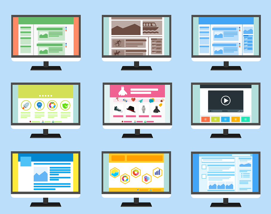
8. Irrelevant images
Another integral element of web design is photos and graphics. Images have the power to convey complex thoughts and emotions without the reader having to read a text physically.
With that being said, your brand shouldn't use irrelevant and low-quality images. Using images that aren't high-quality will ruin your site and turn off visitors.
Quite similarly, using unrelated images will turn off users as well, leaving them confused in what you're trying to convey.
9. Not Knowing your audience
Being an owner of a small business, it's crucial that you know your target audience. That means you have to spend hours researching your typical customer profile and figure out a way how to attract their attention.
Remember the way how your site will look and "feel" will naturally draw in a certain kind of visitors. There are some websites that you encounter that look highly professional. Others seem trendy. Some are a lot bubblier than the rest.
Just don't be a website that tries too hard to please too many audiences at once, though.
If you work hard to please too many people, you don't end up reaching your goals. So, identify the typical profile of your target audience, and then cater to their needs and wants accordingly.
Your website is one of the most crucial elements in your digital marketing strategy. It's the face of your brand and your 24/7 salesperson. That's why designing an extraordinarily unique and compelling site isn't just an option anymore. It is a requirement.
A lot of small business owners out there commit the mistake of developing their websites on their own to have more control of the project and save cash. But what they don't understand is the entire concept of having an excellent web design. As a result, they'll come up with a less ideal site, and it doesn't sustain traffic, or boost sales.
Need help with your website? Get in touch
Top Development and Design trends in 2020
Web is a beautifully designed place for many of us that comes with appealing colors, images, videos and lots of information. Websites are its...