

2 min read
Everything in this world works on data. But, data is of no use if we can’t gain any insight from it, for which it has to be simple and easy to understand. This is the reason why data visualization came into the picture.
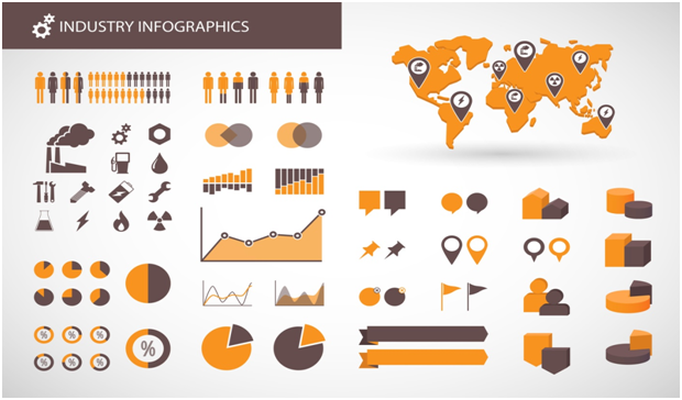
Any data which can be presented in the form of charts, graphs, maps, or images that can communicate a relationship to its viewers and involves a systematic mapping between data values and the images formed is known as Data Visualization.
It helps in transforming data into visual objects and therefore helps in providing an accessible way to understand trends, outliners, and patterns in data. The goal is to communicate information clearly and efficiently to users.
Data Visualization in Statistics
Due to enhanced technology and faster data availability with a reliable source is an easy task. But once all that information has been gathered, what should companies do next? How do you use these large data sets in business? The raw data looks like a cluster of numbers or figures which are difficult to interpret. Therefore, to gain some inference from the raw data it is important to organize and visualize the given information into something much more usable and more digestible, so that it may create a visual that instantly communicates a story.
Statistics act as the lifeblood to the business; it not only helps in making key business decisions but also increases effectiveness and efficiency into the business. Through data visualization, it’s easier to notice patterns and identify how various data points relate to each other. Business leaders can also look at recent historical trends and determine where those trends might go and how best the company can capitalize on them. With raw data, many of these instances would be hard to figure out, but after employing statistics and utilizing data visualization, the correlations can quickly become evident.
Visualization in Market Research

There has been a lot of interest around the subject of data visualization by the marketing research industry, as it helps the researchers to retain more information and provide a practical solution to research problems. It is found that the best way to understand the given research findings is through data visualization. It is an important tool for professionals in all fields. At least 2.5 quintillion bytes of data are created every single day. Concise charts and intuitive interfaces help to process that data deluge and convey important insights to key audiences.
Data visualization helps market research in many ways such as:
- It helps in determining the needs of the target customers.
- It helps in analyzing the perception of the customers with regards to the available products.
- It also helps in implementing the required strategies to accomplish the common goals of the business.
Conclusion
Thus, we can say that data visualization gives a visual summary of information and makes it easier to identify patterns and trends than looking through the unorganized clutter of numbers. Charts and graphs make the data easy to understand and help in communicating the data findings through different trends and patterns.